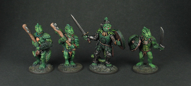
Photographed against my usual dark gray paper backdrop. The paper came from a scrapbook type craft shop and it's a kind that has a white back. This will serve as the control in this little experiment. The pros for this technique are it's quick and no adjustments in post are necessary. The images also have a sort of fancy or cinematic feel imo. They're in the spotlight. The con here is that unless you have a high quality monitor the images probably don't look their best in daylight due to glare. This is mainly a failing of the monitor and not the image per se but all the same I think this is a pretty significant drawback and it's the reason I'm considering other options.
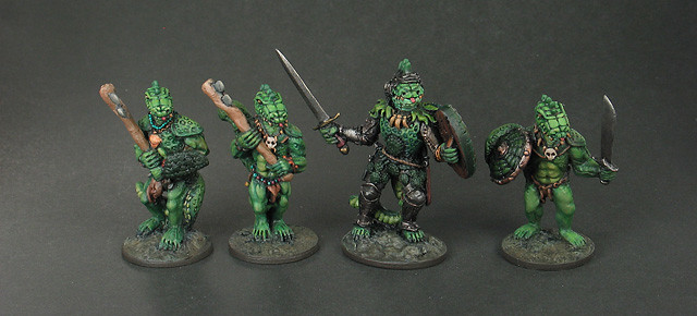
Photographed against the same paper as above but with foil reflectors behind to reflect back light. This gives more definition to the figures and lessens the shadows in the back but adds shadows in the front that makes the paper seem glossy despite it actually being fairly matte.
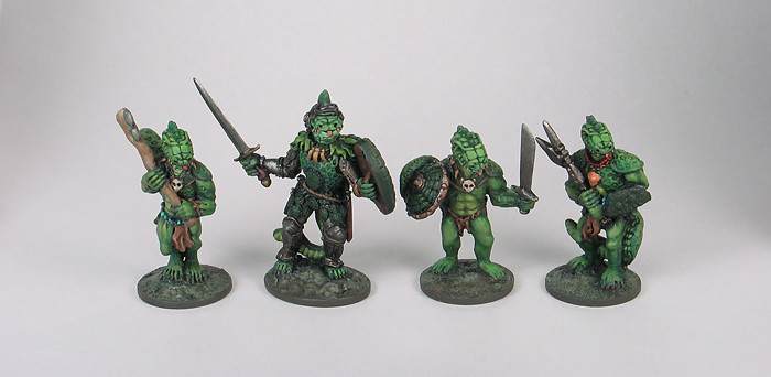
Photographed against light gray paper with no adjustments made. This looks pretty good to me and the light background means you don't have to worry about that glare issue I mentioned above.
However, without an overlay effect like you see in the tests below the figures have shadows around them and this has always bothered me more when the figures are against a light backdrop than a dark one. This is actually the sole reason I switched to the dark backdrop for this project but the shadows aren't that noticeable now as I'm viewing them in this comparison. After all, the pictures against the dark backdrop have equally noticeable ones.
What do you think: should I go this way or stick with the way I've been doing it?
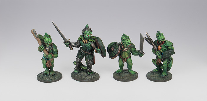
Photographed against light gray paper with a gradient effect overlayed in Photoshop. The reason for the screen is to get rid of shadows.
I used to use a variation of this technique when I was painting professionally and I like this effect quite a bit. However, this takes time to magic wand the figures and apply the overlay and because of the shear volume of figures I need to photograph this technique is definitely not feasible for this particular blog.
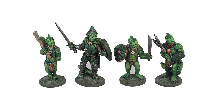
Similar to the above. Photographed against the same light gray paper but with a white screen effect overlayed in Photoshop. This is a popular way to show catalog figures on the web as it's clean and centers the eye on the figures.
Exact same con as the one above. Only takes a fraction of a minute per pic, but it adds up big time.
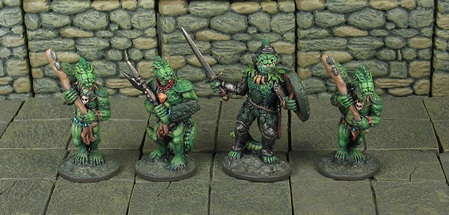
Photographed against Dwarven Forge terrain. This is my least favorite of the bunch because the terrain creates a distracting uniform pattern. However, it might be just a little unfair to have used lizardmen as they are green and you have green against green. By the way I plan to paint my troglodytes intentionally in the exact same colors as the Dwarven Forge and I'll be sure to get a pick of that but maybe that's neither here nor there./

I don't think there's any great need to alter your existing method, but if you were to change the fourth image looks the best to me. However, (and I never really realised before) the dark grey backdrop has become something of a trademark for this project!
ReplyDeleteI personally find miniature photography something of a pain and I'm only just starting to get the hang of it (having actually read my camera manual!) Anyway, do what the hell you want: I'll still come and ogle.
Thanks for yr thoughts. I think I agree the fourth is probably my pick. It's one of the ones that needs the magic-wand step though and the pics are already a lot of work. Still thinking... I do kind of like the feel of the dark pics because they feel more "of the depths" or whatever, so if not too many people say the dark ones suck I might just keep going on as I have been. :)
DeleteThe gray back drop works best. From day one I thought "this guy know more about photography than I do, his pictures are really nice looking!" And spot-on what Gareth writes, it's a signature style for this blog and really allows the models to look their best, they're very easy to inspect and look at.
ReplyDeleteI like the dark grey background as well. I've been taking pics of some of my figs for the Otherworld forums using a white backround and wasn't completely satisfied with the results. Based on your pics, I recently tried a black background and was much happier with the way things turned out.
ReplyDeleteThe 5th version is probably my least favorite.
This comment has been removed by the author.
ReplyDeleteDark Grey background for sure, it really makes the figures stand out. The light background looks like they are in front of a bright window or something, it mutes the overall effect.
ReplyDeleteThe terrain piece looks cool, but it's meant for more of a tabletop game display or diorama type thing.
I'd like to also mention that i really like your classic lizardmen, they inspired me to grab a couple of the same make&model that I had collecting dust in my bucket of metal and slap some paint on them. You are an inspiration to me and some of my pals who like bringing these old minis to life w/ a modern paint job.
I guess this system doesnt allow us to edit posts, so I deleted the prior one. It didnt contain anything important
Thanks for your thoughts... pretty sure now I'll stick with the dark background. Will be doing a proper post for these lizardmen here asap and hope to see yours on the web too! Thanks for the kind words.
DeleteThanks guys... more votes for the dark background have pretty much alleviated my worries. Will keep on truckin' with the dark background for now.
ReplyDeleteThe dark gray seems good as long as your figs are bright (like these). I wonder if the lighter one would work better with dark color schemes. And I second that motion about inspiration...your lizardmen made me dig deep into my collection, too. I'm working on a Grenadier beholder right now, with a Heritage ogre on the way. Cheers!
ReplyDelete