Wednesday, August 29, 2012

Unearthed Internets: D&D Diorama by J. B. Waskul Creative Works & Concepts

From the Unearthed Internets file comes a wonderful, large-scale (1/30th) D&D diorama by one J. B. Waskul featuring iconic monsters like the umber hulk, night hag, naga, fire giant, troll, beholder, roper, lich and stone golem. Obviously some love went into it.

Umber hulk strikes from the shadows: Detail from Waskul's diorama

The piece is photographed in details like this. My only regrets are there is no shot of the piece as a whole (which Waskul says stands 3') and it could really use a dusting with a big soft brush and/or compressed air to restore its luster.

Sunday, August 19, 2012

Heartbreaker

Painted: Succubus

As Joeksy the dungeon brawler taught us, never trust a hot chick in a dungeon! No time is this more true than when you encounter one of this ilk. Be wary; her charms are deadly.

Not that this advice is going to do you much good, though. With the succubus's array of psionics and spells it's unlikely you'll know what you're up against until you're in her arms and with but a kiss your soul is drained away level by level in as few minutes.


Manufacturer: Grenadier
Line: Julie Guthrie's Personalities
Figure: 881 Succubus
Release date: 198?
Sculptor: Julie Guthrie
Painter: Spooktalker
Date painted: 2010

I painted this one as a gift for my GF but I'm sure she won't mind if I borrow it for a game or three. Meanwhile I have another casting of this sculpt and one of the other Guthrie succubus for when I can get to them. Like most of the Guthrie grenadier personalities these are available now from Mega Miniatures.

As always, the collection can be viewed in its entirety at flickr. And don't forget when roleplaying your succubi to, in the words of Gygax, avoid melee and "use guile, treachery and etherealness whenever possible."

Friday, August 17, 2012

Miniatures Photo Tests


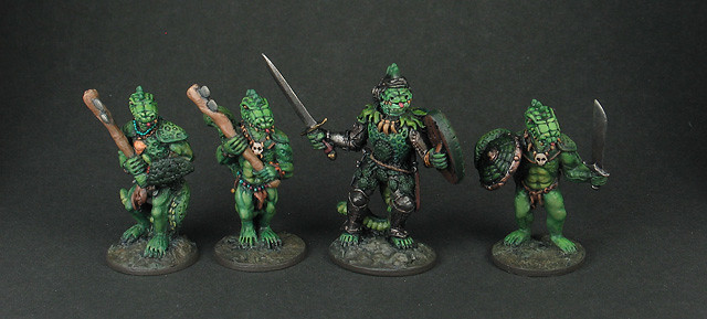
Photographed against my usual dark gray paper backdrop. The paper came from a scrapbook type craft shop and it's a kind that has a white back. This will serve as the control in this little experiment. The pros for this technique are it's quick and no adjustments in post are necessary. The images also have a sort of fancy or cinematic feel imo. They're in the spotlight. The con here is that unless you have a high quality monitor the images probably don't look their best in daylight due to glare. This is mainly a failing of the monitor and not the image per se but all the same I think this is a pretty significant drawback and it's the reason I'm considering other options.

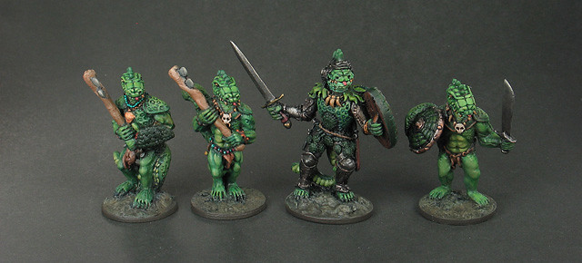
Photographed against the same paper as above but with foil reflectors behind to reflect back light. This gives more definition to the figures and lessens the shadows in the back but adds shadows in the front that makes the paper seem glossy despite it actually being fairly matte.

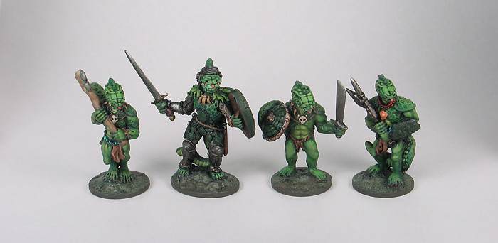
Photographed against light gray paper with no adjustments made. This looks pretty good to me and the light background means you don't have to worry about that glare issue I mentioned above.
However, without an overlay effect like you see in the tests below the figures have shadows around them and this has always bothered me more when the figures are against a light backdrop than a dark one. This is actually the sole reason I switched to the dark backdrop for this project but the shadows aren't that noticeable now as I'm viewing them in this comparison. After all, the pictures against the dark backdrop have equally noticeable ones.
What do you think: should I go this way or stick with the way I've been doing it?

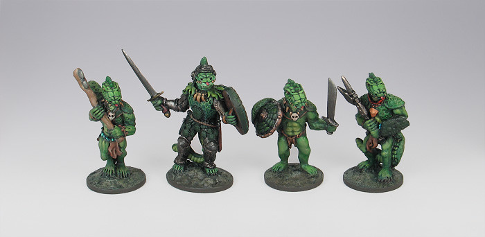
Photographed against light gray paper with a gradient effect overlayed in Photoshop. The reason for the screen is to get rid of shadows.
I used to use a variation of this technique when I was painting professionally and I like this effect quite a bit. However, this takes time to magic wand the figures and apply the overlay and because of the shear volume of figures I need to photograph this technique is definitely not feasible for this particular blog.

Similar to the above. Photographed against the same light gray paper but with a white screen effect overlayed in Photoshop. This is a popular way to show catalog figures on the web as it's clean and centers the eye on the figures.
Exact same con as the one above. Only takes a fraction of a minute per pic, but it adds up big time.

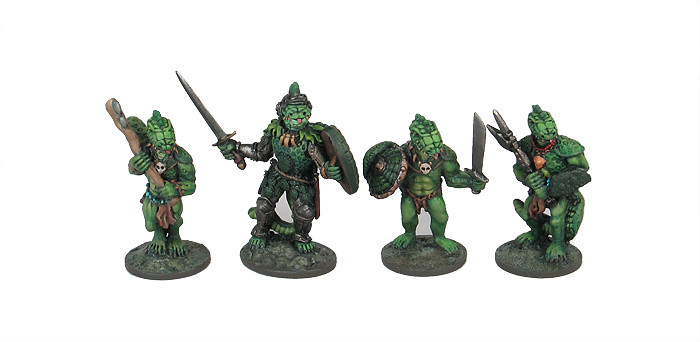
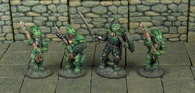
Photographed against Dwarven Forge terrain. This is my least favorite of the bunch because the terrain creates a distracting uniform pattern. However, it might be just a little unfair to have used lizardmen as they are green and you have green against green. By the way I plan to paint my troglodytes intentionally in the exact same colors as the Dwarven Forge and I'll be sure to get a pick of that but maybe that's neither here nor there./
I mostly did the tests to help myself find the best method but with any luck this is helpful to others as well. Please let me know if you've got an opinion on which way I should go!

Friday, August 10, 2012

BftD One Year Anniversary

BftD turns one today! Thanks everyone who has followed along or dropped in to leave a comment. I knew when I started my initial focus on vintage D&D figs would make it a challenge finding an audience as compared with some of my previous ventures in the Warmachine/Hordes world or even as compared with Necromunda, which is, itself, a fairly niche thing judging from how many people come up to me at a con with something to effect of, "that still exists?"

And I wasn't wrong. It was a struggle getting some momentum behind the blog. I feel as though I'm straddling two communities with the D&D project without the benefit of being able to stand firmly planted in either. And I'm not even talking about the D&D community vs the miniatures community, but rather I'm still on the fringe of even the niche OSR community within the D&D community and likewise on the fringe of the niche skirmish miniatures and old school miniatures communities. It's funny to think that when fantasy miniatures got their start the idea of fantasy miniatures was synonymous with D&D and how nowadays beyond prepaints there is little interaction between what are now two hobbies rather than one.

But I feel like BftD is starting to build up speed now and I'm really glad I've found common ground with many of you and many of you have found a reason to stick around. At the outset of BftD year two my obsession with D&D shows no signs of slackening and I've got a lot coming down the pipe, or I guess that should be up the throat. I'm fairly determined to make what you find here the finest, most comprehensive and most-functional collection of D&D miniatures on the Web. And I also have a bunch of terrain projects to share as well as big backlog pics of Necromunda, Hordes, Warmaster and old school Warhammer fantasy to throw at you among other things. The D&D is actually a latecomer to my list of pet projects if you can believe it. Cheers to another year!

Monday, August 6, 2012

Painted: Kobolds

Minifigs Kobolds

These wretched, nasty dogmen delight in the basest forms of torture, the most unsporting and opportunistic of murders, and ghoulish traps of many an exotic variety. Whatever you do, don't let their cuteness fool you—it's their strongest means of defense!


Manufacturer: Minifigs
Line: Dungeons & Dragons
Set: KL1-5 Kobolds
Release date: 1977
Date painted: 2011
Notes: These are converted. The crests, horns and diamond-shaped back and chest plates were added. A few were given arm and weapon swaps.

A collage of kobold shields. I designed these on paper before transferring to the miniatures and took inspiration from shield designs from our own world. The shields are about 1/4 the size of my thumbnail.

Kobolds Shields

Lots more pics of the finished figs on flickr in case you're interested, including rear views and individual shots.

Here's what I started with:

Minifigs Kobolds

I took the shots of the plain lead for the Lost Minis Wiki (and they're also on flickr of course).

And here's a size comparison. They're tiny; some of the few I've seen that approach the size they should be. They're about 3' 4" in 25mm scale, where the Monster Manual says 3". Pardon the gloss; they hadn'tt got their dullcote when this pic was taken.

Minifigs Kobolds WIP

And here's a pic of the conversions I did. Despite being official D&D figures they were missing some key elements I like about the Monster Manual art. I added the crests, embellished what used to be plain, circular chest and back plates, and made horns out of the little dull nubs they had previously. And don't get me started about what a royal pain it was cutting and filing their bases into an oval shape.

Minifigs kobolds (showing conversions)

More WIP shots are on flickr.

Ok, that's it for now! I actually launched into a long general commentary on kobolds' place in the game and the various kobold figs you can use for 25mm but this is a long one already and the night is wearing on so I will save that for a future post.

Friday, August 3, 2012

Unknown Painter: Amazonia Gothique

Unknown painter is a series of posts featuring figures I picked up that are painted by others. I did not paint these.

Kickin' off a series of posts showing figures in the state I acquire them. Most of the figures I pick up go right in bath of Simple Green ASAP without a second thought. A few, though, have paintjobs worth sharing here even if I strip them in the end. This for kicks and to help in some small way our record of how figures were painted in yesteryear.

This first post is going to set the bar really high, though, so don't think they are all going to be this good. Don't worry, she's not going anywhere near the bath! And in that respect I think she's the first. She might even get a spot in the display case.


Manufacturer: Citadel
Line: Limited Editions
Set: LE15
Figure: LE15 Amazonia Gothique
Release date: 1986
Sculptor: Michael Perry
Painter: unknown
Date painted: unknown
Notes: This was sculpted after a John Blanche painting that appeared on the cover of White Dwarf issue 79. Minor restoration done in 2012.

So you can see the figure is not only painted well, but it's done after the painting. And the shield, while different, is pure Blanche in style.

I really lucked on on this one. I got in line for the Kublacon 2012 fleamarket way too late and with the fire code restricting how many people could be in the room at once it was about forty minutes after opening that I got in. Which means hundreds of clamoring, sweaty gamers passed over this before I came around and picked it along with six Citadel gnolls (which I may share later on) for just $15. A friend was looking over my shoulder trying not to smirk as I made the deal, but I made no attempt to haggle and the woman turned and checked it with her husband before handing them over so I am guilt-free. It was only after I got the figure out of the convention hall that I realized their was a decent paintjob under all the dust. For a Blanche fan like me it was a solid win! The fig and the painting have been favorites since way back in the day.

For those into the old school methods this paint job is instructive and demonstrates what can be done with a technique that relies heavily on washes and glazes. The greens are especially vibrant as the white primer is doing the highlighting work. The stocking looks like it is simply flesh colored glazed with black.

Also, I have to take a little credit fixing up the base. The earth colored foam you see was there already, but sides of the base had sloppy, thick brush marks and bits of debris caught under the paint. This kind of thing ruins a figure for me so I sanded the sides down and repainted them. She also had little holes either side of her tab as the tab is smaller than the slot, and that's another thing I can't stand for. I added a little more earth colored foam and a little static grass, and finished it off with a tiny bit of green foam for contrast.